This is the second part of a post on using customer journey mapping as an analysis and problem identification tool to help pinpoint the range of organisational factors that impact an employee experience – and by doing so, enable us to design more precisely targeted interventions to improve it. Part 1 provided an overview of customer journey mapping, and background and context to the problem I was trying to address with it. Read Part 1.
This second post describes how I used the journey mapping technique to map the employee experience, how it enabled more effective framing and problem analysis, and the outcomes and learning from that.
The process: what I did and how
1: Journey mapping research
Although I had a pretty good idea of what a customer journey map was and what it was used for, I’d never done it before and needed to research (at speed) how to undertake the process. These were the starting resources I found really useful to easily and quickly get my head around ‘how’ to map experiences:
- Use Customer Journey Maps to Uncover Innovation Opportunities, IDEOU – great post that describes the purpose and process of creating a customer journey map in a really simple and accessible way. Highly recommend reading this first.
- Journey Mapping Toolkit, Heart of the Customer – the toolkit I mentioned in Part 1 post. Well worth downloading (it’s only 9 pages) – Heart of the Customer are specialists in the CX (customer experience) mapping space, and explain succinctly and clearly the nuances and bigger picture strategy behind customer journey mapping: purpose, steps, and how journey maps can be used to help drive change. I also found this toolkit useful for providing visual layout possibilities (two really good examples shown). One valuable takeaway for me was that there is no ‘standard’ design for a customer journey map. Whilst there tend to be a few common features of journey maps – persona details, phases / touchpoints, emotional state – how you lay it out depends on your purpose —–> so, be clear on what you’re trying to achieve before you undertake the mapping process.
- Customer Journey Maps – the Top 10 Requirements (Revisited), Heart of the Customer – really valuable additional practical tips for creating a journey map (although I broke the ‘don’t use Powerpoint’ one…!). Also found this post useful for additional examples of map layouts.
2: Qualitative data gathering: “interviews” (or if pressed for time like I was – targeted, informal conversations)
A journey map is, in essence, a visual, narrative representation of a whole load of qualitative and quantitative data about a particular employee experience. I knew from initial conversations that trainee drivers were the primary audience experiencing the issue, so I delved deeper into this trainee experience by having conversations with Bus Operator Trainers (workplace trainers who undertake the formal training and assessment components of the driver training, have contact with trainees on the job, and still drive some shifts to maintain their own on-job competency).
Normally, you would gather as much of this qualitative data as possible – mostly from interviews with the actual target audience group – to create the experience map. Interviewing employees from the target group enables you to:
- gain insight and empathy into their experience (which is the focal point of the map), and
- identify particular ‘personas’ (i.e. subsets of employees with similar goals, skills, behaviour patterns, attitudes or experiences). You would then map a journey for each key persona identified. Interviewing other stakeholders and people involved throughout the employee experience is also important for building an accurate and holistic picture of the experience.
I only had about a day to gather and collate data. I didn’t have the time to speak directly with extensive groups of trainee drivers so created an initial view of the employee experience based on the conversations I’d already had with trainers, a bus operator, former operators, managers and other stakeholders.
After ‘storyboarding’ the content from these conversations (i.e. transcribing / summarising / theming / extracting key quotes) , and looking at some customer journey map examples, I had a clear idea what I wanted to my map to show:
- the employee’s emotional experience (highs and lows) throughout their first 12 months, then 12-24 months, mapped against the key milestones in the traineeship program (a.k.a ‘touchpoints’ in journey mapping lingo)
- the organisational issues contributing to these experiences, the people involved, and subsequent business impacts (primarily emerging from the low points of the employee experience)
- potential opportunities for improving the experience and business outcomes – identifying where each of the current initiatives, proposed and potential/possible solutions might fit within the employee journey to resolve a current pain point in their experience.
3. Quantitative data gathering: HR and business data
As I didn’t have enough qualitative data to identify discrete personas, I used generic HR demographic data of trainees (average age, gender, ethnicity etc) to create a kind of generic, ‘everyman’ persona*. I also noted and gathered any HR data that would be useful as business impact indicators relevant to the driver training experience (e.g. exit rates, absenteesim, sick leave rates over the time period covered), and collated any quantitative data from reports, previous audits, focus groups and surveys that was relevant for building a more complete picture of the employee experience.
* This is a bit of a ‘hack’ of a standard customer experience mapping process, but it enabled me to at least produce an initial ‘MVP’ (Minimum Viable Product) view of the problem in the limited time I had. This was sufficient for my immediate needs and could also be used as a starting point for further validation and persona creation.
4. Designing the experience map
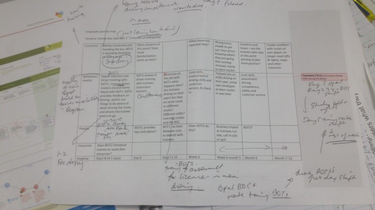
4a: Sketching a layout
Once I had a clear idea of what I wanted to show, I sketched a basic layout.
4b: Deciding what tool to use
I used PowerPoint. Although there are journey mapping tools available (including free ones), which I did briefly review and consider, I didn’t have the time to learn a new tool (less than 1 day to produce the map). I also wanted to be able to easily share / email / print the output, and for others to be able to edit in future if needed. I already knew PowerPoint could do all of these things. So I started by looking for an existing PPT template. I found these links:
- How to make your first customer journey map (Quick Guide), EnvatoTuts+ – useful overview on customer journey mapping, plus links to some templates (most of which didn’t suit my purposes)
- Customer journey map template, Clarabridge – This was a print based PDF (not digital) which I only realised after downloading – might be useful if mapping in a group, during the data collection phase, or as a tool to help you to think through what data you might need.
- Journey Mapping Template, KB & Co – the closest to what I had in mind…but I ended up not using this specific template as I wanted to include more than just simple emoticons to represent the emotional state, and additional info on issues and business impacts which this template didn’t have.
Given that none of these were exactly what I needed I decided it would be quicker and easier to create my own from scratch rather than attempting to adapt one of these templates.
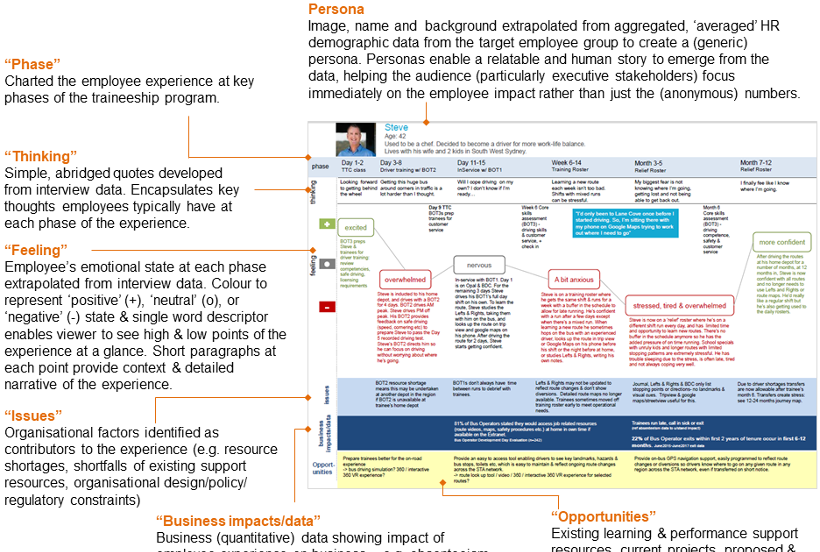
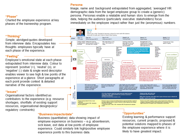
The annotated employee experience map below describes and explains each part of the map I developed, the data it shows and its purpose.
Outcomes & learning
My original intent was to use this technique as an analysis and problem identification tool – to better see and understand the complexities of the problem we were dealing with, identify the impacts (on employee engagement and business), and map out the current state (what do we already have? what are the issues with the current solutions? where are the gaps and opportunities?).
I was in a situation where I already knew some of these details, but needed to get a range of stakeholders (including internal executives and an external vendor) across it accurately, succinctly and very quickly in order to appropriately position a new project.
I also took it as an opportunity to personally learn, apply and experiment with a technique commonly used in the consumer (marketing, product and UX design) space to the internal corporate HR/OD/L&D space.
So – how effective was employee experience mapping in helping me to achieve these goals? And would I use it again? Very, and absolutely. Some of the things that surprised me were:
- just how effective it was in communicating – instantly – a range of complexities and nuances in the problem state, and the impacts on both employees and the business. The visual narrative was a far more effective and powerful overview – particularly for executive stakeholders – than even a highly summarised and succinct text-based analysis report (which, incidentally, I also did). I find increasingly, that leaders – especially exec – simply don’t have the time to read, digest, or interpret information. This format provides a visual, one-pager enabling an ‘at-a-glance’ holistic understanding of the problem.
- how powerful adding ‘thinking’ and ‘feeling’ elements, written up as first person quotes, can be for communicating pain points and employee engagement impacts in a relatable and authentic way – especially when combined with a persona (even if it is an aggregated one).
- how much data you can pack into a single (A3) page – without it seeming overwhelming. Experience maps are commonly dense with data from a range of sources but don’t ever really feel difficult to digest or understand. Again – I think format of making the emotional experience the primary vehicle for telling the narrative makes an enormous impact (without really taking up that much space). Using simple visual information design techniques like colour and icons can also help communicate this emotional experience more succinctly. The time based (temporal) aspect of the layout also contributes a lot – it enables you to easily pinpoint exactly where and when the biggest issues and opportunities are – so everyone can see much more precisely what we should be targeting or prioritising, at what point of the program or experience. And by lining up business impact data with the peaks and troughs of the employee experience – you can clearly and visually show the relationship between people engagement and bottom line stats.
I also saw and learnt the value and importance of close collaboration with HR when looking holistically at the employee experience – not only because recruitment and pre-employment phases transition directly into onboarding and induction and can have a big impact on employee attitude and experience, but also for the insight HR data and analytics provides on the employees we’re supporting and designing for, and in quantifying the business impacts associated with the high and low points of the employee experience. I was fortunate at the time to be working as an OD Business Partner in a team of HR Business Partners embedded within the business – and can certainly see the positive impact that an integrated, holistic HR/OD/L&D approach could have on employee experience, particularly for recruitment, onboarding and retention.
Employee experience maps as enablers for empathy, action, influence and stakeholder engagement
Ultimately – I think the power of experience maps lies in their ability to show relationships between disparate sources of data in a compact and visual way, and enables a way to humanise data by transforming it into an empathetic and relatable story. It is this human aspect of data – the meaning behind the numbers, rather than the numbers themselves – that can be a much more effective trigger for action. Employee experience maps therefore – can also act as an effective tool for influencing up and stakeholder engagement, in addition to better problem analysis and identification.
…and more…
Yes – there’s more to this story, but as this post is now getting into too long territory I’m going to save that for a third installment – which will cover how the employee experience map can be used as a foundation for solution evaluation – to more effectively evaluate and identify which solutions best meet employee needs at the various touchpoints or phases of their journey.
This third part was inspired by Michelle Ocker’s post on using Bob Mosher and Contrad Gottfredson’s ‘five moments of need’ to evaluate learning technologies – which I happened to read around the same time as I engaged in this employee mapping exercise. I thought it was absolutely genius, and could instantly see the value and application of that approach to what I was undertaking in this project. So…..in the next post I’ll describe how I integrated the ‘five moments of need’ into the employee experience map in order to evaluate which solutions best meet employee needs at various phases of the experience.

The detail, resources and lessons learned in this post are really useful Tanya. You will inspire many people in HR and L&D to apply employee experience journey mapping.
Can you give examples of the questions you asked (or would ask) in the interviews / discussions at Step 2 of the process to elicit the right kind of input for a powerful employee experience map.
Hi Michelle – Thanks for reading and commenting! And good question. The idea at this stage is really to fully understand the employee experience, context & current state so questions that start as very open then drill down to probe specifics are helpful…eg (when talking to trainers & trainees/employees): “Take me through the process…what do you do/how do you do it”; “What do you find trainees struggle most with?”; “why?”; “how do you know?”; “what feedback have you had/what do trainees say?”; “describe the experience/ what happens/what are you thinking/feeling at that point?”/ “what’s the impact?” (-> these types of questions are key to experience mapping as responses provide the basis for extrapolating the ‘thinking’ & ‘feeling’ elements & quotes which can be powerful too).
To understand the current issues and potential opportunities, questions like these are helpful: “what resources do they/you currently use to support them (on the job)?”; “how and when are they used?”; “how effective are they?”; “what are some issues/challenges?”; “what else do you do to help you learn…(routes/job task)?”; “what else do you think would be helpful?” / “how could we improve…?”.
This qualitative data was obtained through informal casual conversations rather than a formal interview process. I had a few questions jotted but didn’t really follow a prescribed structure and I think that perhaps helps..going into it simply with a genuine desire to understand the experience (…then using the mapping as a framework for sorting through it all and constructing it into a meaningful artifact later!).
The other important thing is to talk to a range of people to both validate the data (confirm it is definitely a problem) & to build up a picture of the complexities and impacts – eg. here, I had also spoken with schedulers, business/ops managers, HRBPs, IT & comms (who were also working on an internal solution) to understand the landscape – what we already had, what had been tried, barriers & challenges to solving the problem etc. As I mentioned in comment on twitter, having access to (the right) people with the information (by being embedded in the business), knowing who to go to and existing relationships within the business helps immensely and is a real enabler to undertaking this process efficiently.
…that’s not to say that the same can’t be achieved by an external consultant – not at all – but the ability to establish genuine trust and credibility quickly becomes much more important when operating as an external comsultant/practitioner.
Hi Tanya, I came across of your blog post as I am facing a similar challenge. Do you by chance have the slides mentioned here Employee Experience Journey Mapping workshop slides (https://www.slideshare.net/DesigningCX/employee-experience-journey-mapping-workshop-slides/). Unfortunately the content is no longer there.
Hi Pavloos sorry for the late reply – I didn’t realise they had taken that slideshare down. I’ll see if I have or can locate any other references and/or update the link. Thanks for letting me know.
Tanya